Windows 11 – First Glance at it.
It’s that time… The time in which Microsoft finally has planned a new Windows, and it hasn’t happened in 6 years.
Microsoft is finally planning on releasing a new operating system, called Windows 11. Many people thought that Microsoft would make Windows 10 into, just Windows, but we were wrong, because there was a leaked ISO file that apparently represented “Windows 11 Developer Edition”. This shook me, even though I was on a Mac (but I have a Windows Laptop). Me being a website owner, I immediately looked more into it, asking myself:
- Would my website look good on Windows 11? After all, over 2000 people see my blog every month.
- Are there going to be errors with plugins, or certain parts of the site?
- Is my site font going to be recognised by the OS?
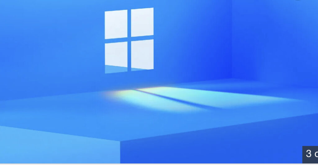
I hadn’t even looked at the interface and the rumours. Many YouTubers were pointing to Microsoft’s tweet. Here it is:
Look at the time of the event, doesn’t it look suspicious? 11 a.m. might be a spoiler of Windows 11. Look at the picture, the first thing that comes to my mind is: Surface Logo. It is most likely that that will be the new logo of Windows 11. Many people also say that the number 11, which is illuminated from the Windows Logo. I don’t think that can be proven as a “leak” though. Enough of the rumours, let’s look at the user interface. I currently do not have access to the OS, even though it would be great, but I am going to be using various sources (mostly from YouTube and I’ll be giving my review).
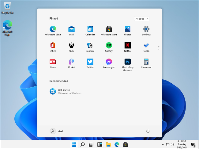
This is how the desktop looks:

When I first saw it, I said to myself: Ew, why is the start screen centered?
And I started to hate it… I quickly changed my mind, because you could put the icons on the left or right, so I was relieved. Let’s start with the deep review.
- Desktop and first impressions
I love the new desktop, except one thing. If you look at the bottom right corner of the picture above, you will see the time, day and date. I don’t like the fact that they had to squeeze them, because it just makes the taskbar bigger. If they could remove “Tuesday”, it would be the best, at least for me, but it is very handy.
2. Icons
The new icons that are with Windows 11 have a lot more depth and realism in them. Generally, I think these icons are one of the best ever made.
3. Compatibility
This is where it gets weird. According to Windows Central, Windows 11 cannot boot on MBR devices. I am not sure if it is 100% correct, though. I highly doubt it.
4. Setup Interface
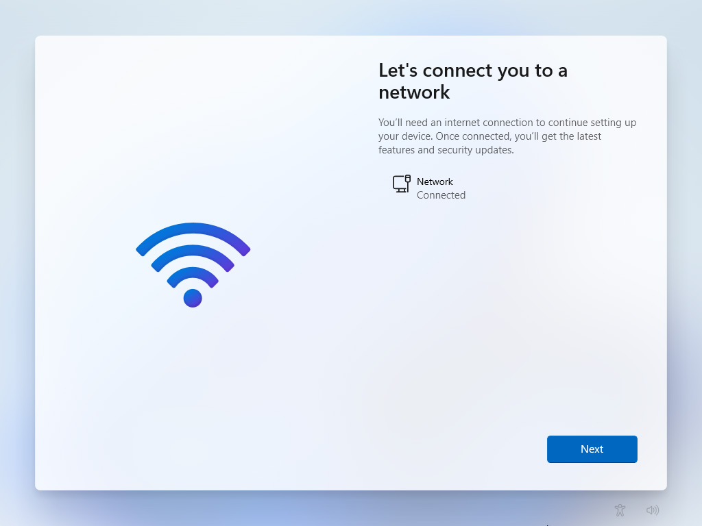
The setup interface is new and modern, just take a look at it. It really looks like Windows 10X’s setup screen.

5. Compatibility with Microsoft Surface™ Devices
I think this is where Windows 11 really shines. For example, Apple iPad™ tablets have their own custom os, iPadOS™. I think that with Windows 11, it can be a little bit more appropriate for Microsoft’s tablet devices. Windows 11 is almost like “SurfaceOS”, something similar. It feels like it is built for it. Here are all the compatible devices with Windows 11:
PC or Laptops other than Surface Tablets:
- 1GHz Processor (1.8GHz and above is recommended)
- 20GB of space
- 800×600 screen resolution
Surface Laptops and Tablets:
- Every Device from 2016 onwards
Thank you for reading. Please make sure to subscribe if you like this blog! Bye for now!